A Grid-Template-Areas Intro For Beginners
PublishedFeb 24th, 2022

One of the coolest features of CSS Grid is your ability to almost have a visual layout of your elements and how they map to your grid represented right there in your CSS.
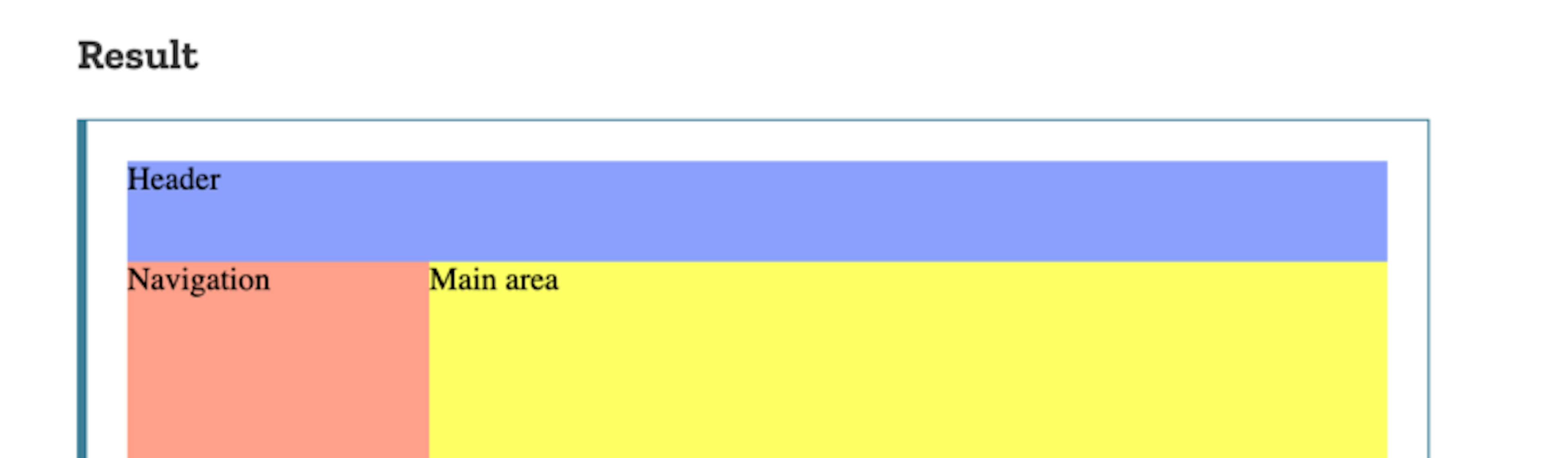
Let’s checkout a classic page layout as is used in the example in the MDN docs:
<section id="page">
  <header>Header</header>
  <nav>Navigation</nav>
  <main>Main area</main>
  <footer>Footer</footer>
</section>
and the CSS:
#page {
  display: grid;
  width: 100%;
  height: 250px;
  grid-template-areas: "head head"
                       "nav  main"
                       "nav  foot";
  grid-template-rows: 50px 1fr 30px;
  grid-template-columns: 150px 1fr;
}
#page > header {
grid-area: head;
background-color: #8ca0ff;
}#page > nav {
grid-area: nav;
background-color: #ffa08c;
}#page > main {
grid-area: main;
background-color: #ffff64;
}#page > footer {
grid-area: foot;
background-color: #8cffa0;
}The grid-template-rows and grid-template-columns properties are defining the dimensions of the grid cells.
In this case they’re saying give me:
Grid-template-areas property is a property used to assign other elements to these cells we just created by using separate strings for each row and spaces within each string to separate our columns.
grid-template-areas: "head head"
"nav main"
"nav foot";Note: No commas are used in between strings, and number of rows / columns must form a rectangle to be considered valid.
Now all that’s left is to make some CSS rules to actually name the elements we want to appear where we mapped them out in the above code. The following does just this:
#page > header {
  grid-area: head;
  background-color: #8ca0ff;
}
#page > nav {
  grid-area: nav;
  background-color: #ffa08c;
}
#page > main {
  grid-area: main;
  background-color: #ffff64;
}
#page > footer {
  grid-area: foot;
  background-color: #8cffa0;
}


