CSS Container Query Me Like I’m Five
PublishedFeb 27th, 2022

Note: CSS Container Queries are only currently supported in Google Chrome Canary (the unstable branch). Once you’ve installed Canary, you need to enable the CSS Container Query flag by navigating tochrome://flagsin the address bar, searching forcontainer queriesand checking Enabled.
This is not at all meant to be a technical explanation of how to use, or what is a Container Query.
There is plenty of documentation out there already— a lot of which is technical and very much subject to change. See the end of this article for some of those links.
All this is meant to be is a simple introduction to CSS Container Queries using a likely use case that I have run into before when I first realized the limitation of viewport media queries, aka CSS Media Queries.
So what the hell is going on here?
I have these little cards that flow, wrap, flex, twirl, squeeze, okay I’m going overboard, but anyway a lot happens to them because they are flex children and their flex container does all these things to them (which is great!) so that they fill up the container and stay inline with each other (sometimes).
Well that’s super. Jah bless CSS Flexbox.
But we’ve got a problem. We only want to show the avatar circle when there is room for it, i.e. when the card is big enough.
This could be done with viewport media queries like we’re used to using, such as
@media (min-width: 768px) {
  .avatar {
    display: block;
  }
}
But it would be a nightmare to have to write all the media queries to target specific device widths where we would want to show and hide our avatars.
You might be able to do some quick math to figure out these breakpoints, but then what if I made it more difficult by adding a sidebar, let’s say that dynamically changed width?
Ohhhhh boyyyyy.
See, all we want to care about — when it comes to styling (showing and hiding the avatar in our case) is the size of the card (or container).
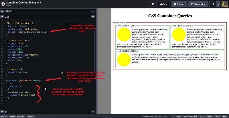
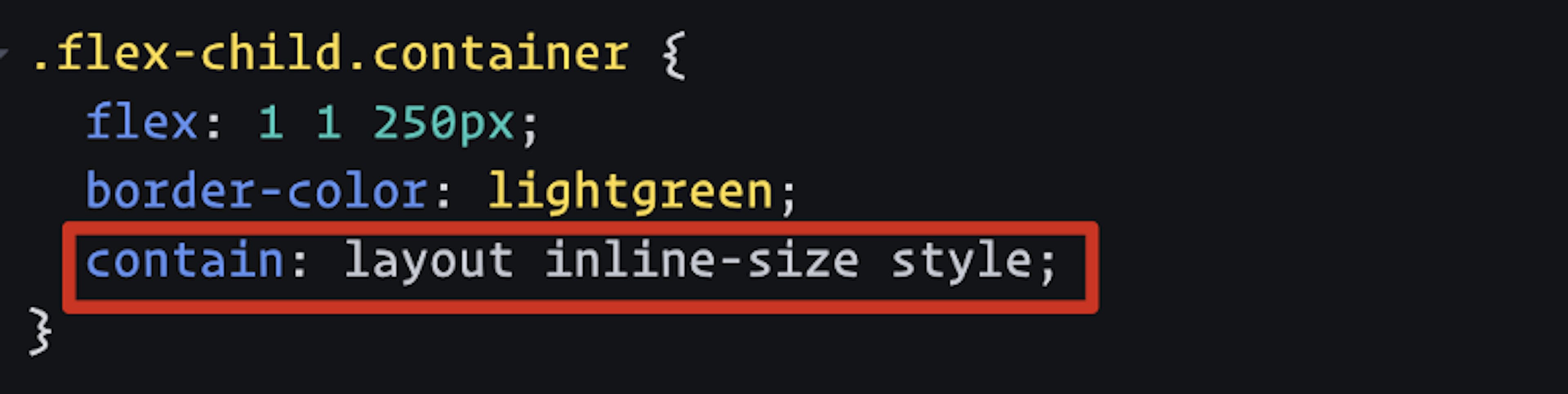
The key steps we took here were:
That’s really it.
You may be asking: “What’s the deal with the values for the contain property?”
You can find explanations for the currently accepted values in the W3C’s Editor’s Draft but I will warn you it’s highly technical and subject to change.
Moral of the story is that lots is yet-to-be-determined, but as I understand it — the general concept and how we use container queries will likely look a lot like what we just did above.
Code on web assassins!


