Simple Stepper With Alpine.js
PublishedFeb 26th, 2022

First day at a new position.
They’re always a doozie, but I think given that fact, it went considerably well.
So.
Nine hours of work in the can and what would a sane and rational person do once that quittin’-time-horn sounded?
That’s right. He would scarf down some food and get on CodePen to goof around with Alpine.js.
Nailed it!
Well done. Now pat yourself on the back and let’s make a little stepper thing using this new directive-driven “just sprinkle a lil’ of this on your HTML” — micro-yet-modeled-after-Vue framework.
TL:DR
Note: This demo was done using AlpineJS 2.8.0. Alpine 3 brought some breaking changes, including replacing x-spread with x-bind. I suggest you read the migration guide for moving from version 2 to version 3 before beginning this tutorial.
Doing something quick and dirty for a demo we’re using CDN’s.
1. Import Bootstrap 3 (I found an old jQuery stepper and repurposed it)
<link rel="stylesheet" src="https://maxcdn.bootstrapcdn.com/bootstrap/3.3.5/css/bootstrap.min.css">
2. Import Alpine.js
<script src="https://cdnjs.cloudflare.com/ajax/libs/alpinejs/2.8.0/alpine.js"></script>
3. We’re gonna be using x-data, x-bind, x-show, x-spread, and x-on:click (@click is shorthand). All of these directives are from the available directives found on Alpine’s GitHub page.
As tiny as this little thing is, we probably could have used a few different approaches — but as I was set on playing with the new (newer?) fancy little x-spread directive, I chose this route and contrivedly forced it in there.
:|
Here’s a quick run-down on what these directives do in James-terms:
x-data This is an important one. x-data declares a new “component scope”. By putting this on some parent element, you’re allowing all of that element’s children to have access to the data passed through it as a Javascript object. In it’s most ridiculously simple form it could look like this:
<div x-data="{name: 'bob'}">
  <span id="name" x-html="name"><span>
  <!-- Renders bob to the span's innerHTML -->
</div>
Prettttty ridiculous. Like I told you.
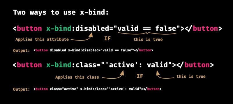
Next is x-bind. If you’re at all familiar with Vue.js or some arcane version of Angular, you know that this directive is a powerhouse. Especially if you’re one to frequently wield attributes/directives in your markup — this directive can be very useful when paired with CSS and other imperative javascript.
x-show If you understood the previous one but you can’t figure this one out, you’re backwards. You just are.
But yes, it shows elements by toggling on/off display: none.
Note: I actually didn’t use x-show in the demo.
x-spread is an interesting one. Pairing it with x-data allows you to pass a function that returns an object containing functions expressions that can be re-used for DRYer code.
Here’s an example from the Alpine.js Docs:
<div x-data="dropdown()">
    <button x-spread="trigger">Open Dropdown</button>

    <span x-spread="dialogue">Dropdown Contents</span>
</div>

<script>
    function dropdown() {
        return {
            open: false,
            trigger: {
                ['@click']() {
                    this.open = true
                },
            },
            dialogue: {
                ['x-show']() {
                    return this.open
                },
                ['@click.away']() {
                    this.open = false
                },
            }
        }
    }
</script>
x-bind:click="" aka @click="" is obviously an on-click event handler. It fires a function or assigns a value of whatever is within the parenthesis.
With these directives and some style-sugar from Bootstrap, we got ourselves a cute little stepper!
BONUS TIP for anyone who made it this far.
If you want to hide elements before Alpine is initialized to prevent flickering, you can add x-cloak to the element and add this simple CSS rule to your styles:
[x-cloak] { display: none; }Alpine.js will remove the x-cloak directive for you and show your content once the library is ready to rock-n-roll.
Here’s the demo:


