My Misconception About Flexbox Space Distribution
PublishedFeb 27th, 2022

“The trouble with old men is they remember so many things that ain’t so”
-Mark Twain
After years of using Flexbox — I recently discovered that some flex behavior wasn’t exactly as I expected.
When something like this happens, I have a bittersweet feeling.
On the one hand, I’m happy to be correcting some errant beliefs about how something works — but on the other hand— I’m a little ashamed to have gotten this confident about using something I don’t quite totally understand.
You’re probably familiar with the Flex: shorthand property for flex-grow, flex-shrink, and flex-basis (in order of values used).
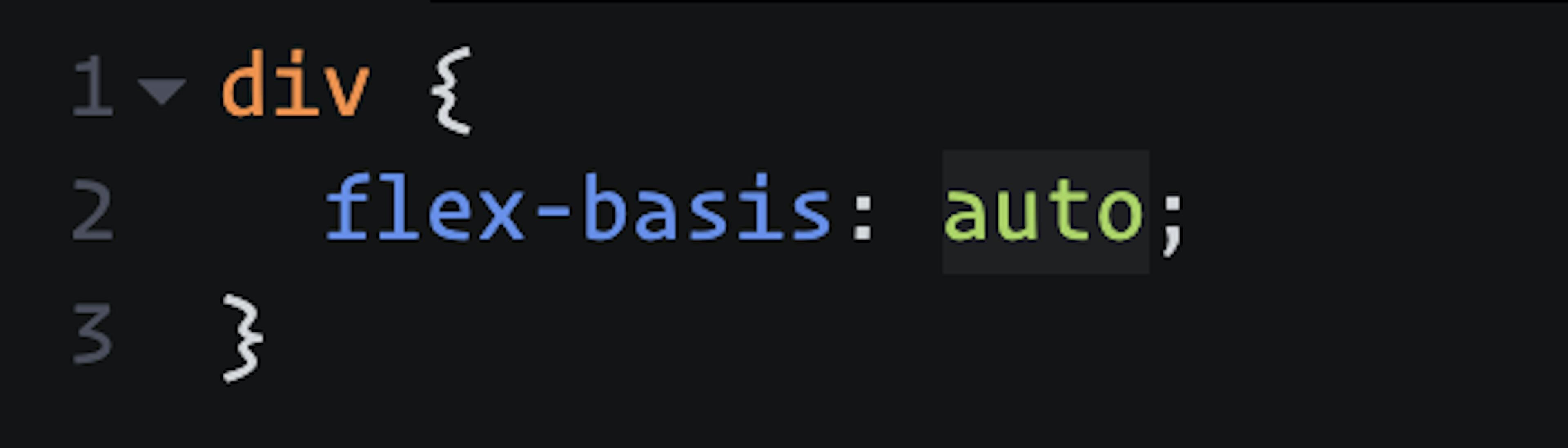
A flex item’s flex-basis can be thought of as the desired width (or height if the flex direction is set to column) of the item’s initial state (before it starts flexing).
Yeah…sure…but…why is this important?
I never fully understood. But I have a better understanding now and I will attempt to explain.
Let’s say for example that a flex item’s flex-basis is explicitly set to 400px.
The calculation performed by Flexbox to grow or shrink this item depends on whether or not the flex item’s current width is above or below this number.
When the item’s width is smaller than the flex-basis the flex-shrink factor comes into play and the amount that the items are shrunk by is a factor of the flex-shrink value given.
Good and fine.
So the amount that the flex item’s grow by must also use some multiplication using the flex-grow factor and the current flex item’s width just like with flex-shrink right?
Actually, not really.
Once our flex item reaches some point over 400px, Flexbox adds up the flex-basis for all flex children, and then calculates the available space left.
(flex container width) - (flex item A's width + flex item B's width) = Available Space Remaining
Now, Flexbox needs to distribute this available space to the flex children.
It does so by dividing the available space remaining by the sum of all flex-grow values for all flex children.
Let’s assume some values for a couple flex children:
.flex-item-a {
  flex-basis: 400px;
  flex-grow: 3;
  flex-shrink: 1;
}
.flex-item-b {
flex-basis: 200px;
flex-grow: 1;
flex-shrink: 1;
}So, let’s now add up all flex-grow values and divide our available space by this number.
(Available Space Remaining) / 4 = Chunks to be distributed to each flex item
We now have 4 chunks of space to distribute, and how many chunks each item receives depends on what the flex-grow value is set to for each flex item.
We told our Flex Item A to grow by a factor of 3, so we multiply a “chunk” by 3 and give that much space to Flex Item A.
Our Flex Item B had a flex-grow value of 1, so we only give it one chunk of available space.
For more visual learners out there, this may be better understood by examining how items are flexing using your developer tools and closely examining behavior of different Flexbox configurations.
I created a CodePen to help visualize how the Flexbox calculations affect the proportionality of each flex item.
For a more comprehensive understanding of Flexbox, I recommend some of the following resources:
Code on web assassins!


