
Mobile Menu Dropdown Without Javascript
PublishedFeb 24th, 2022

I had learned a while back how to toggle state using a <input type="checkbox"> and styling things by use of the :checked pseudo-class. At that time, I used what I had just learned to create a button that when clicked would get a drop-shadow.
I just dug it up if you wanna check it out:
[codepen https://codepen.io/James0r/embed/VwZrgRY?default-tab=html%2Cresult]
Well today I needed to build out a mobile menu for a hobby site i’m working on (www.hourofhistory.com) and decided I would employ this vanilla CSS technique for achieving it.
Here are the steps I took to get a fairly smooth functioning CSS-only mobile dropdown:
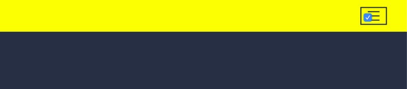
1. First, let’s write out our basic structure
<header>
  <div class="hamburger-container">
    <div></div>
    <div></div>
    <div></div>
    <input type="checkbox">
    <nav>
      <ul>
        <li></li>
        <li></li>
        <li></li>
      </ul>
    </nav>
  </div>
</header>
It’s key that we add our <nav> after our checkbox because as of this writing, there are no selectors that target previous siblings and our styles to display/hide the <nav> will be made relative to our checkbox.
2. Next I’ll add some basic styling so that this demo doesn’t hurt my eyeballs so much.
body {
  background: #262f43;
  margin: 0;
  padding: 0;
}

header {
  height: 60px;
  width: 100%;
  background: yellow;
  display: flex;
  flex-direction: row;
  justify-content: flex-end;
  align-items: center;

  .hamburger-container {
    margin-right: 5vw;
    padding: 6px 12px;
    border: 2px solid #262f43;
    position: relative;

    & > div {
      width: 22px;
      height: 2px;
      background: #262f43;
      margin-bottom: 6px;

      &:last-of-type {
        margin-bottom: 0;
      }
    }
      input[type="checkbox"] {
        position: absolute;
        width: 100%;
        height: 100%;
        top: 0;
        right: 0;
        bottom: 0;
        left: 0;

        & + nav {
          display: none;
        }
      }
  }
}
The important thing to note about this technique is that we’re employing the use of a checkbox that has two states; checked and unchecked. We need the functionality of the checkbox without having its appearance on our page.
If you click anywhere on the hamburger button now your checkbox will become checked.
Sweet.
3. Now I want to add a box-shadow to the .hamburger-container when the button is clicked. Here’s the thing though — the button container is above the checkbox in the DOM-tree — and we’re only able to style siblings that come after our checkbox and any descendants of said siblings.
Then I realized — wait — the checkbox is now the same size as our button container and I can definitely toggle the checkbox’s styles.
So let’s now take advantage of the :checked psuedo-class and add a box-shadow and transition to target the box-shadow.
Our input[type="checkbox"] CSS will now look like this:
input[type="checkbox"] {
  position: absolute;
  width: 100%;
  height: 100%;
  top: 0;
  right: 0;
  bottom: 0;
  left: 0;
  margin: 0;
  box-shadow: 0px 2px 5px 5px rgba(0,0,0, .3);
  transition: box-shadow .5s;

  &:checked {
    box-shadow: none;
    transition: box-shadow .5s;
  }

  & + nav {
    display: none;
  }
}
Now clicking on our hamburger menu anywhere should check the checkbox and trigger our depressed button box-shadow effect (if it doesn’t checkout the finished demo at the bottom of this article and compare).
4. We got a problem though — our checkbox is still visible and we want to hide that sucker. If we use the visibility: hidden or display: none properties, our checkbox box-shadow wont be visible, and with display: none it will become inoperable and completely useless. So instead let’s just remove any visible attributes of it.
input[type="checkbox"] {
  position: absolute;
  width: 100%;
  height: 100%;
  top: 0;
  right: 0;
  bottom: 0;
  left: 0;
  margin: 0;
  box-shadow: 0px 2px 5px 5px rgba(0,0,0, .3);
  transition: box-shadow .5s;
  -webkit-appearance: none;
  appearance: none;

  &:checked {
    box-shadow: none;
    transition: box-shadow .5s;
  }

  & + nav {
    display: none;
  }
}
Our CSS rule for our checkbox now hides the browser styles with -webkit-appearance: none; and appearance: none; and is now invisible but retains state — which is critical for our purpose.
5. Now we pretty much have our hamburger icon (with state now) squared away and we can turn our focus to the <nav> and how we’re gonna unhide it.
I forgot to add some actual content to my nav items so let’s do that first. My markup for my nav now looks like this:
<header>
  <div class="hamburger-container">
    <div></div>
    <div></div>
    <div></div>
    <input type="checkbox">
    <nav>
      <ul>
        <li>
          Item 1
        </li>
        <li>
          Item 2
        </li>
        <li>
          Item 3
        </li>
      </ul>
    </nav>
  </div>
</header>
6. We’re now ready to hook up our checkbox state to our <nav> element. I will provide the SCSS in a second, but let’s look at the compiled CSS which is really the crux of this walkthrough:
header .hamburger-container input[type=”checkbox”]:checked + nav {
 display: block;
}
The CSS rule says “Hey, so like when the checkbox is checked I want to apply the following rules to the element that follows it” (we add nav for semantics but you could use + * just the same).
Now, when you reload your page there will be your <nav> element obscuring the view of your button. Not ideal, but we’re not done yet and you should notice that if you click where the button would be if you could see it, the <nav> should disappear.
Perfect! It’s working!
7. Okay, now let’s address this ugly <nav> that’s overlapping our hamburger button.
If we leave this thing in the normal document flow, it will linger in-or-around the .hamburger-container which is its parent. We don’t want that.
We want it to be full-width and positioned immediately below the header bar.
So let’s pop it out of the normal flow with position: fixed;.
In our example, the header always remains a height of 60px so let’s use top: 60px; to position our <nav> just below our <header>.
Expand the width of the <nav> to fill its container (the viewport) with width: 100%; and position it to the left edge with left: 0;.
Finally, center text with text-align: center; and get rid of the ugly list item discs with
ul {
 list-style: none;
}
Add a yellow background to dropdown to visually associate it with the header and we should be good to go.
Here’s my CodePen of the result:
[codepen https://codepen.io/James0r/embed/dyYoyMY?default-tab=html%2Cresult]
Hope this was helpful! Until next time…


