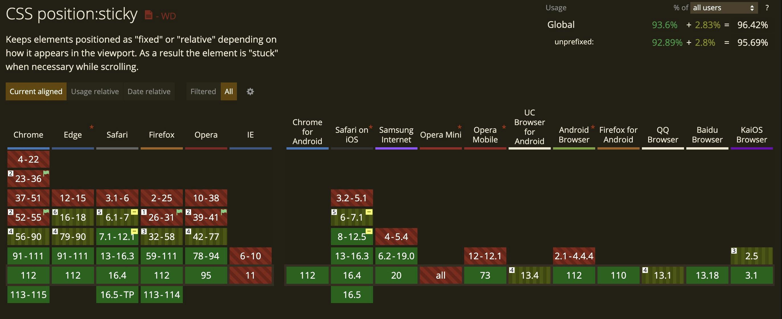

I usually try to stay near the cutting-edge of front-end web techniques and tools, but browser support concerns often hamper implementing some new convenient way of achieving something. Such was my concern with using the CSS position: sticky for an element as critical to a site as the site header is.
As with so many styling challenges, there are often "many ways to skin a cat."
If you are so lucky with your requirements that you don't even need the header to stay in view while scrolling then you don't have to worry about any complicated styling and just style the element as you would any other block level element.
But so often as front-end dev's--we don't have this luxury.
The Position Fixed Way
I'm almost amazed at how long I've stuck with this approach in light of overwhelming browser support for position: sticky.
Most of you have likely used this before. The technique is pretty straight forward.
1) Create a header element with a fixed height and position: fixed and position the element to the left-most, top-most, and right-most position relative to the viewport.
<header>
  Fixed Header
</header>

<style>
header {
  position: fixed;
  left: 0;
  top: 0;
  right: 0;
  height: 50px;
}
</style>
2) Give a margin-top to the next adjacent element that matches the height of the header. We can use a CSS custom property (variable) so that we only declare our height once. It could look something like this:
<header></header>
<main></main>

<style>
:root {
  --header-height: 50px;
}

header {
  position: fixed;
  left: 0;
  top: 0;
  right: 0;
  height: var(--header-height);
}

header + * {
  margin-top: var(--header-height);
}
</style>
Good stuff.
The Position Sticky Way
The position fixed method is all well and good, but can become a real headache when your header (or masthead if you wanna call it that) is comprised of multiple element that are collapsing under certain conditions etc...
Unless you've come up with some really clever way of keeping your <main> element's margin-top in sync with the header height by using CSS variables or javascript--or some other clever method--we can find ourselves in a "position" where things overlap and/or our code is really starting to bloat and stink.
All these problems really arise from the simple fact that we have taken our header out of the normal flow and now have to manage its and other's positions in the document ourselves.
Using position: sticky allows us to hand this responsibility back to the browser.
TL;DR
All we really have to do to achieve the floating header on scroll now is apply position: relative to our header's containing element (i'll assume it's the <body>), slap position: sticky on the header as well as top: 0 to tell the browser how we want to position it relative to its containing element and we should be good to go. The result could look like this:
<body>
  <header></header>
  <main></main>
</body>

<style>
body {
  position: relative;
}

header {
  position: sticky;
  top: 0;
}
</style>
We can notice that not only have we used less code to achieve our "floating" header, now if our header or any of its inner elements change, our header's adjacent sibling will compensate for this automatically via the magic of our browser.
Position Sticky Conflicts
If you've played with position: sticky before, you may have found that it doesn't work as expected under certain circumstances. A couple of the most common issues is when an ancestor of our position sticky element uses overflow or display: flex.
I've found an excellent article that details how to troubleshoot these issues. Give this a read if you're having issues.
Browser Support

At the time of this writing position: sticky has had major browser support for several years now going back many browser versions. Still, based on your project you may need to reference https://caniuse.com/css-sticky if you need to support some dinosaur browser version.
Code on web assassins!


