Ensure Retina/High-Resolution Image Rendering For Custom Wordpress Theme
PublishedFeb 28th, 2022
Wordpress image template tags such as get_the_post_thumbnail() and wp_get_attachment_image() leverage the <img /> tag using the browsers conditional image rendering by using the srcset and sizes attributes.
Understanding how these attribute values are parsed by the browser is critical to understanding image rendering with Wordpress template tags, and I encourage you to first study these concepts before continuing with this article. MDM provides a decent explanation of these attributes in their article on responsive images.
It’s important to also understand that Wordpress does not convert image sizes on the fly. Instead, Wordpress automatically converts images when they’re uploaded in the admin to various sizes based on Wordpress’s own presets and any sizes that are specified in your custom theme by way of the add_image_size() function.
With this in mind, we can use add_image_size() to ensure that proper image sizes are pre-converted and ready to deliver to the browser.
Let’s say for example we have a custom logo that we know we want to render at 400x by 100x. We can add the following functions to our functions.php file to ensure that when the site admin uploads the custom logo (actually any image) Wordpress prepares a 1x and 2x version of our image for responsive image loading.
add_image_size('custom_logo', 400, 9999, false);
add_image_size('custom_logo_2X', 800, 9999, false);
UPDATE: According to a footnote on the WordPress page and several unrelated articles, there may be unwanted side-effects if the height argument is not passed or is passed false/null. Therefore, the above lines now include 9999 for unconstrained heights.
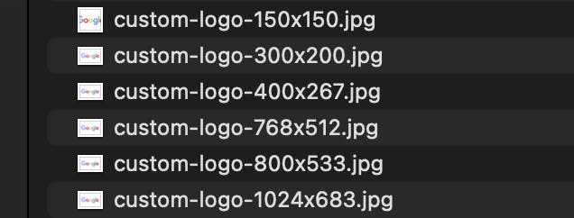
Go ahead and upload any image and check your /wp-content/uploads/ directory and you’ll find that your images have been converted to not only the Wordpress preset sizes — but also a 400x wide version and a 800x version.
Finally — so that we’re on the same page — navigate to the theme customizer and selected this image for your theme’s logo.
By now you should have a decent understanding of how srcset and sizes attributes in <img /> tags work.
Let’s use the following snippet to render our img tag:
<?php
  echo wp_get_attachment_image(
    get_theme_mod('custom_logo'),
    'custom_logo',
    false,
    array('style' => 'width: 400px; height: auto;')
  );
?>
NOTE: As of I don't know when, to take advantage of large images in your srcset, you may need to raise the limit on srcset images to be included. See https://wordpress.stackexchange.com/questions/316853/control-the-srcset-much-more-not-all-sizes-in-it-each-time
We passed the following arguments:
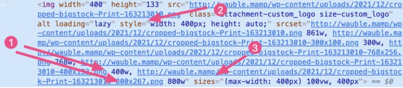
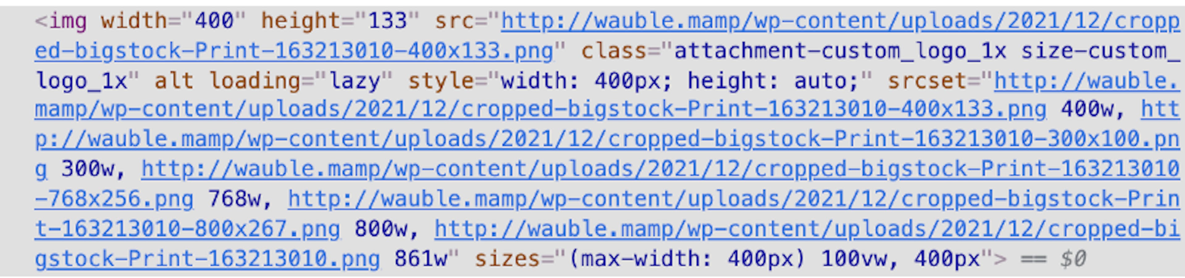
Above is what is rendered out — with the key points numbered.
Let’s go over them:
If you use your devtools and set your view mode to responsive mode, you can test your image rendering at various resolution factors and notice the behavior. Be aware that your browser is using efficient caching so you need to make sure you are clearing the cache often to correctly see which images are being loaded.
Hope this helps clear up retina images in Wordpress for y’all.
Code on web assassins!


