
Create Wave Border with SVG and CSS Clip-Path
PublishedFeb 24th, 2022

I was playing around with the ScrollMagic scroll animation library yesterday when I got the idea to pin some text while scrolling and have it vanish behind some waves.
The idea to use clip-path was fresh in my mind after listening to a recent episode of the Syntax Podcast where they talked about clip-path among other cool CSS properties.
After searching around, I liked the approach I found where you link to an inline SVG as a value of your clip-path property like so:
clip-path: url(#wave);This way I design my clipped path in Illustrator and just copy/paste the code into my HTML.
Here is my working demo using this approach.
As you’ll notice — you’ll want to end up with an SVG block that looks something like this:
<svg>
 <defs>
   <clipPath id=”wave” clipPathUnits=”objectBoundingBox”>
   <path class=”st0" d=”M1,0c0,0–0.3,0.1–       0.5,0.1S0.3,0,0,0.1V1h1L1,0z”/>
   </clipPath>
 </defs>
</svg>
The part we’ll be grabbing from Illustrator (or your favorite vector image editor) is the <path /> tag.
As you see on the opening <clipPath> tag is the clipPathUnits=”objectBoundingBox” is being used. This means that all of our points on our path need to be between 0 and 1.
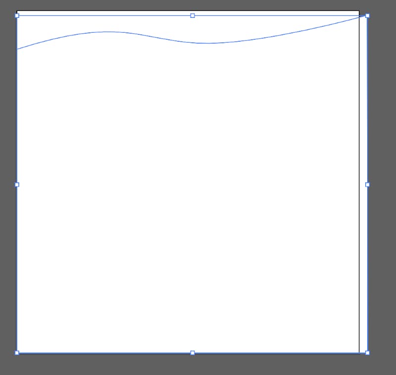
To achieve this, we need to create our artboard as a 1px by 1px box. The aspect won’t be saved when we use it in our page, but that’s okay for our purpose because we want the wave to stretch as the width of our browser grows.
Now we’ll draw the path that will clip our div. It shouldn’t be a problem if you go slightly outside your artboard.
Next go to File > Save As, and select SVG from the Format dropdown menu. Click save and now click on More Options. We want to increase the decimal place to increase precision of your path points. I increased it to 4 decimal places.
Next click on SVG Code and copy the <path> tag from it. Paste it in between those wrapping tags so that it ends up looking like this:
<svg>
 <defs>
   <clipPath id=”wave” clipPathUnits=”objectBoundingBox”>
   <path class=”st0" d=”M1,0c0,0–0.3,0.1–       0.5,0.1S0.3,0,0,0.1V1h1L1,0z”/>
   </clipPath>
 </defs>
</svg>
Create a div, give it a background color and a height and width and now apply the clip-path to it:
clip-path: url(#wave);If you’re wanting to have it overlap the preceding block like I did in my codepen you can give it a negative margin-top to move it up.
and That’s it!


