Centering Flexbox'ed List Items of Varying Widths With Max-Width: Max-Content;
PublishedFeb 28th, 2022

It’s always interesting to me how each developer will employ different techniques to achieve different layouts. It illustrates the creativity and ingenuity of developers and the versatility of CSS.
These unique approaches to styling come with the proverbial “painting yourself into a corner” sometimes though, and it’s at these moments where certain uncommonly used CSS properties are a life saver.
One such CSS declaration is max-width: max-content;
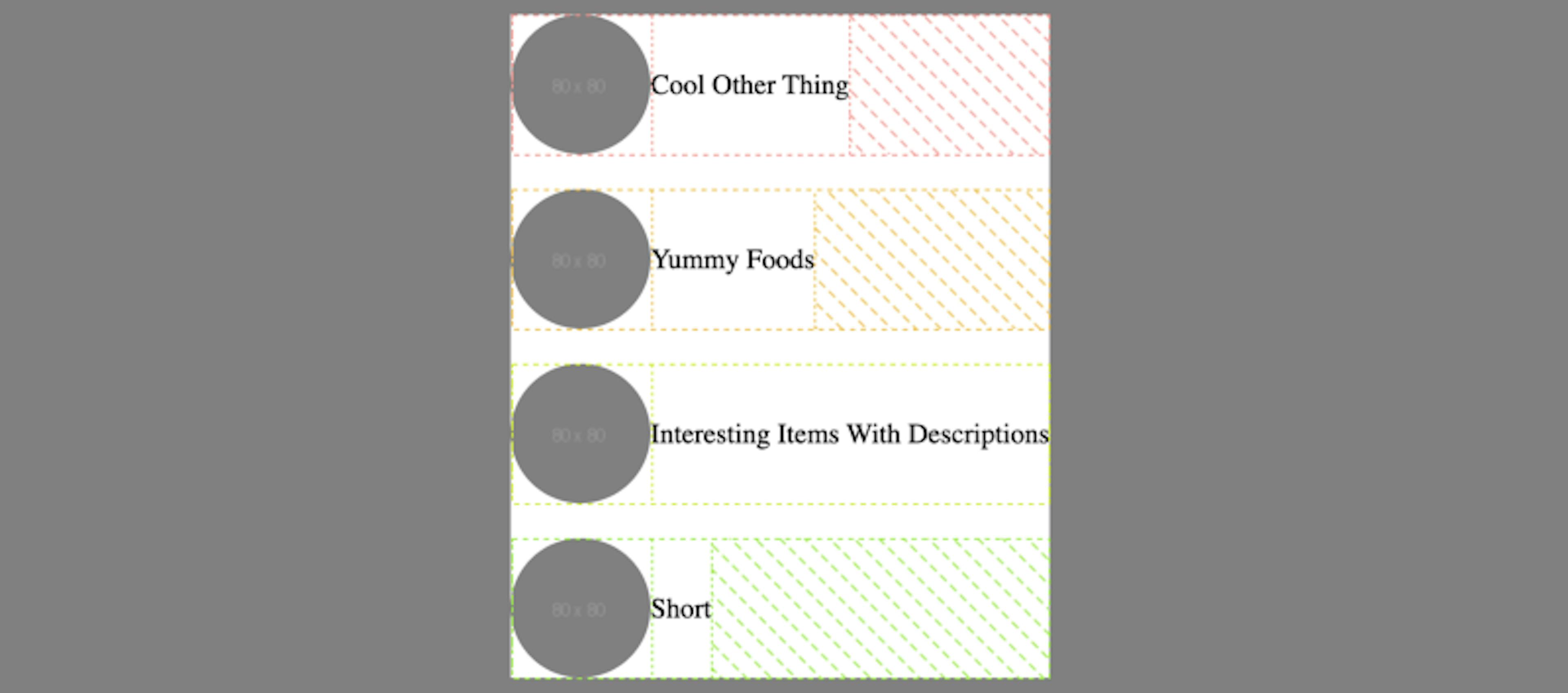
I’ve got a <ul> with some list items with each list item containing an avatar on the left and some title on the right. I want them easily vertically aligned so I slap
display: flex;
align-items: center;
on the <li>.
Cool stuff. They’re looking better.
Now I want to center the <ul> within its containing element.
The thing is though, the flex items expand to fill all available width, and because my <ul> has no CSS to constrain its width, it fills its entire containing element’s width.
I just want the <ul> to be as wide as its widest child, and I want it to remain a block level element so I can add margin: auto; to its inline axis (left and right) to center it.
max-width: max-content; will do exactly that.
Note: You might also want to check out fit-content as well, it considers available space, max-content, and min-content.
Code on web assassins!


