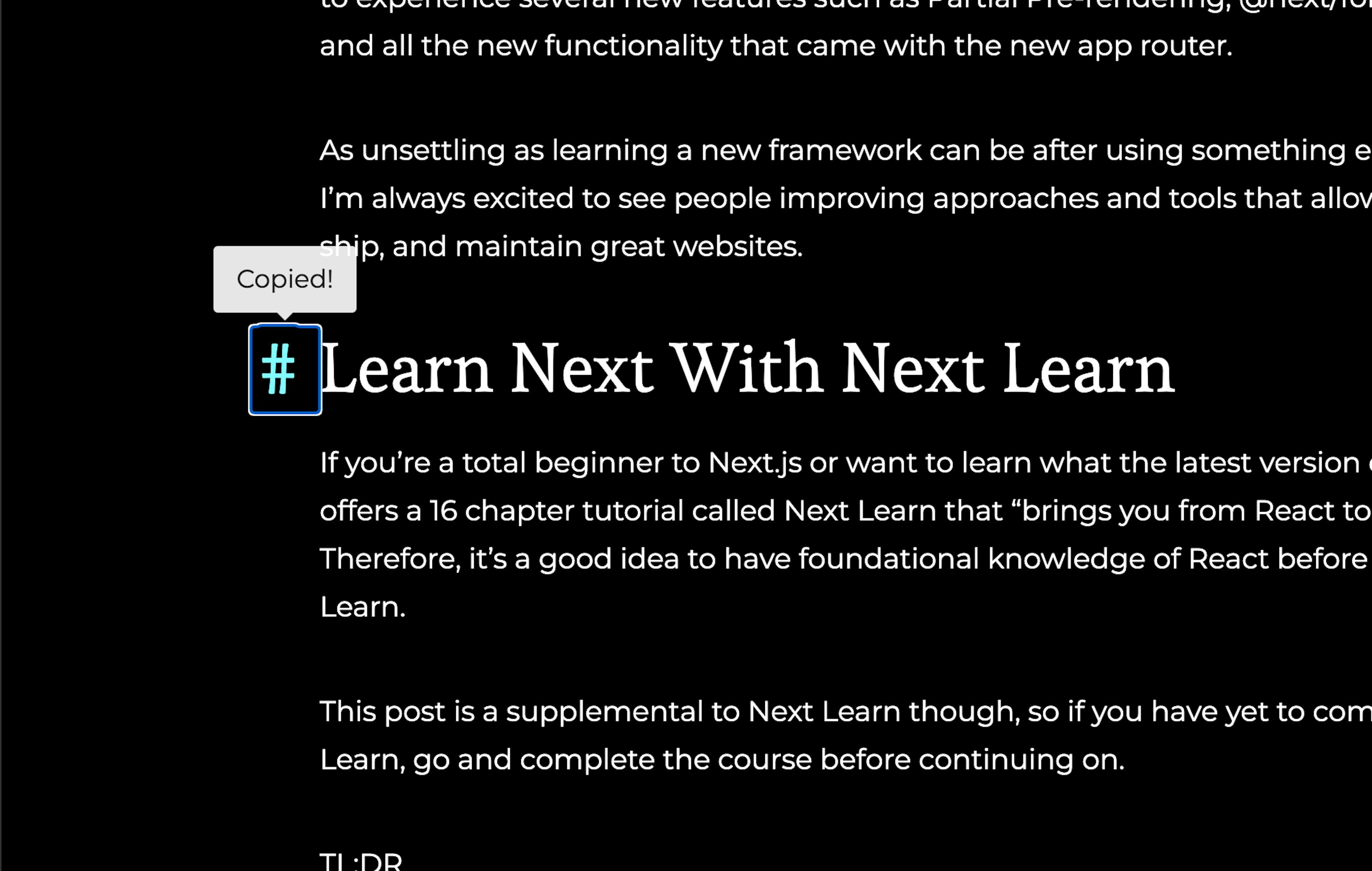

The Astro Simple Blog Template is great, but let's make it better by adding anchor tags with a clickable hash tag and tooltip to indicate to the user it's been copied to the clipboard.
If you're adding this to your existing project then go ahead and skip the next section.
Create our Simple Blog
We can easily create our Simple Blog project by running
npm create astro@latest
name your project and select Use blog template from the next prompt.
Complete the prompts and open up your new project in your editor.
Create our HeadingLink Astro Component
This Astro component will give us some static HTML to wrap our React client component that we're going to create.
---
import type { HTMLAttributes } from 'astro/types'
import ClientHeadingLink from './react/ClientHeadingLink'
import '../styles/headingLink.css'

type Props = HTMLAttributes<'button'> & {
  class?: string
  id?: string
  tag?: string
}

const { class: className, id, tag } = Astro.props

const { pathname, href } = Astro.url
const url = `${Astro.url.origin}${pathname}#${id}`

---

<div class="heading-container">
  <ClientHeadingLink
  url={url}
  tag={tag}
  client:load
  />
  <slot />
</div>

<style>
  div {
    position: relative;
  }
</style>
As you can see, we're passing the URL as well as well as a tag prop to our anchor hashtag for styling purposes.
Install React Tooltip
We'll install react-tooltip to indicate to the user that the anchor URL has been saved to the clipboard.
npm i react-tooltip
Create our Client React Component for our Heading Link
import React from 'react'
import { Tooltip as ReactTooltip } from 'react-tooltip'
import { clsx } from 'clsx'

const ClientHeadingLink = ({ url, tag }) => {
  const [showTooltip, setShowTooltip] = React.useState(false)
  const id = React.useId()

  React.useEffect(() => {
    const timer = setTimeout(() => {
      setShowTooltip(false)
    }, 2000)

    return () => {
      clearTimeout(timer)
    }
  }, [showTooltip])

  const handleClick = (e) => {
    e.preventDefault()
    navigator.clipboard.writeText(url)
    setShowTooltip(true)
  }

  return (
    <>
      <ReactTooltip
        id={id}
        place="top"
        content="Copied!"
        isOpen={showTooltip}
      />
      <button
        type="button"
        data-tooltip-id={id}
        data-tooltip-variant="light"
        data-url={url}
        className={clsx('heading-anchor', tag)}
        onClick={handleClick}
      >
        #
      </button>
    </>
  )
}

export default ClientHeadingLink
Use Our New Component in an MDX File
<HeadingLink id="add-user-registration-to-your-dashboard" tag="h2">
## Add User Registration to Your Dashboard
</HeadingLink>
In astro, your headings will already have an auto-generated id property, but it's necessary that we pass the slugified id to the HeadingLink in order to concat it as a URL to be copied.
You'll want to style your new anchor hashtag, but if it's any help--here is what I used
button.heading-anchor {
  padding-right: 1rem;
  display: inline-block;
  text-decoration: none;
  transition:
    color 0.2s,
    opacity 0.2s;
  opacity: 0;
  position: absolute;
  left: 0;
  top: 0;
  transform: translateX(-100%);
  -webkit-appearance: none;
  appearance: none;
  -moz-appearance: none;
  background: transparent;
  border: none;
  cursor: pointer;
}

button.heading-anchor:active,
button.heading-anchor:hover {
  color: var(--cyan);
  transition:
    color 0.2s,
    opacity 0.2s;
}

div.heading-container:hover button.heading-anchor {
  opacity: 1;
}
Conclusion
So there we have one way to create copy-able anchor link hashtags using Astro and React. This could absolutely have been done using Vanilla Javascript, but since I wanted to use react-tooltip package, I thought why not leverage Astro's islands and make my life easier!
Thanks for reading and code on web assassins!


