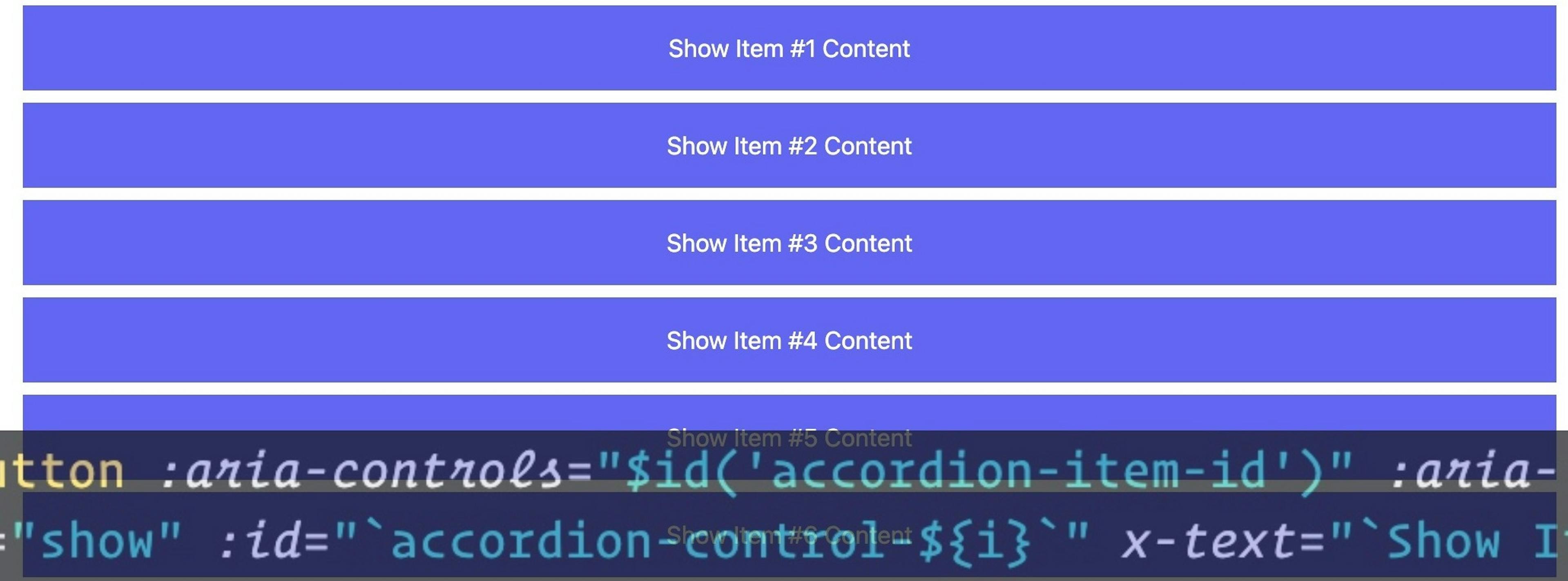

It's rare-if-ever that I go a day without using some sort of accordion component on a website. For frontend developers, it's rare that we go very long without being tasked to build one. Website requirements are calling for more accessible components and all sorts of web development tools are making it easier for us to meet these requirements.
In this post, I'll show you how we can leverage AlpineJS's x-id directive to aid in the use of ARIA tags for an accordion component.
If you're totally new to AlpineJS I suggest you first take their Getting Started before diving into this demo.
Leveraging x-id and $id
Alpine's x-id directive and $id magic property can be thought of as brothers--or maybe cousins. You'll often see them at BBQ's together in the park, or vacationing together at some picturesque island somewhere in the Pacific ocean.
Am I getting my point across?
$id
Let's start with $id. Simply put, $id will render a unique ID regardless of whether or not the string passed to it is unique.
<div :id="$id('some-div')"></div>

// Renders something like
<div id="some-div-1"></div>
Alpine uses some wizardry behind the scenes to ensure there are no collisions with what ID is rendered.
That's why they call them "Magic Properties".
x-id
If we think of $id's as orphans not belonging to any parents, we can think of elements with x-id's as optional parents (ancestors really) of elements using $id.
When elements with $id are wrapped in an element with x-id, Alpine will render the same ID for all $id() used.
This is particular useful for ARIA attributes where we want to point to an element from another element.
<button aria-controls="some-id"></button>

<div id="some-id"></div>
From the official AlpineJS docs:
<div x-id="['text-input']">
    <label :for="$id('text-input')">Username</label>
    <!-- for="text-input-1" -->

    <input type="text" :id="$id('text-input')">
    <!-- id="text-input-1" -->
</div>
Do you see where we're going with this?
TL;DR
We can use these two together to render unique ID's for infinitely repeated items in our accordion.
First, we'll create a reusable component using Alpine.data() within our alpine:init event callback:
<script>
  document.addEventListener('alpine:init', () => {
    Alpine.data('accordionComponent', () => ({
      show: false
    }))
  })
</script>
I'll assume that our accordion is for some kinda of list and use a UL element for our container. For demonstration purposes, I'll initialize our UL element with x-data so we can use x-for to iterate 10 times.
<ul x-data>
  <template x-for="i in 10">
    ...
  </template>
</ul>
Next, we'll use a list item element and define our ID scope as well as define this element as an instance of our accordionComponent.
<ul x-data>
  <template x-for="i in 10">
    <li x-id="['accordion-header-id', 'accordion-panel-id']" x-data="accordionComponent">
      ...
    </li>
  </template>
</ul>
Now we need to create what is often referred to as the header and panel of our accordion item. I'll just use a button element for the header and div for the panel. We'll use the following ARIA attributes:
Accordion Item Header
- aria-controls
- aria-expanded
- role="tab"
Accordion Item Panel
- aria-labelledby
- aria-hidden
- role="tabpanel"
With the heavy use of x-bind to reactively show our ARIA states--and $id to uniquely ID our ARIA associations, we end up with this:
<ul x-data aria-multiselectable="true">
  <template x-for="i in 10">
    <li x-id="['accordion-header-id', 'accordion-panel-id']" x-data="accordionComponent">
      <button :id="$id('accordion-header-id')" role="tab" :aria-controls="$id('accordion-panel-id')" :aria-expanded="show" x-text="`Show Item #${i} Content`" @click="show = !show"></button>
      <div :id="$id('accordion-panel-id')" role="tabpanel" :aria-labelledby="$id('accordion-header-id')" :aria-hidden="show ? 'false' : 'true'" x-show="show">
        <!-- our panel content -->
      </div>
    </li>
  </template>
</ul>
Demo
Accessibility concerns can be quite boring, but they become a lot less painful as we find tools and patterns that take a lot of the sting out of it.
Code on web assassins!


