
3 Things You Should Know When Beginning CSS
PublishedFeb 24th, 2022

I have really been meaning to write this for a few years now, really since my days of grinding trying to build out layouts with major holes in my CSS game.
As with most “Top Things To Learn” articles, this article is completely subjective and mainly based what I found to be “gotcha” topics when it came to styling with CSS.
This article assumes you know the very basics of CSS already such as Selectors, Combinators, Classes, IDs, etc…
If not, internetingishard.com is a good place to start and has excellent explanations and diagrams.
If you do know the bare essentials please read on.
I encourage all those who disagree — or agree — to participate in the comments below.
There are most definitely MANY topics that are critical to know in CSS, but as this article is aimed at beginners — I’ve tried to skim off the top 3 for you to crunch on first.
Alright James, good job, you learned a fancy sounding term to befuddle beginners.
What? No. Really. This is important. Hear me out.
So actually, these are 2 distinct topics but I’m gonna lump them together as #1.
The Document Flow a.k.a. the “Normal Flow”
This is not a specific rule, or function, or statement, rather the normal document flow is the way that elements are laid out (or lay themselves out) in your layout.
You may very well get a lot done before learning this concept, but once I understood it, I found my learning of CSS really accelerate.
The following are points about the document flow that I deem worthy of first knowing:
If you’re struggling with getting your elements to end up where you want them, having a broad high-level understanding of the context in which these elements are pushing and pulling — growing and shrinking, I believe is a good starting place.
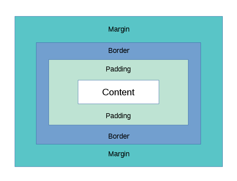
The Box Model
I have talked with some novice level frontend developers who had no idea about what this was, I was shocked to say the least. So I understand that this is not 100% critical to get things done, but again as with the document flow, understanding the CSS Box Model I think is great context to understand how margins, padding and content are calculated.
Not understanding the box model until much later in your learning path can really lead to some bad habits being deeply ingrained in the way you approach styling challenges.
So with that, here are some main pointers I want you to leave with about the CSS Box Model:
That’s really it for #1. I encourage you to read into this in more detail either on MDN or w3schools or something like it.
This one might be just as — if not more important — than #1. I had a hard time choosing.
It was really astonishing to me how far I had made it in CSS/HTML/JS before really diving deep into the position: property of CSS.
I think it’s fair to say that ALL web developers use this property daily — albeit with different techniques.
Here are the critical CSS Positioning points I think you should know:
You can see in the demo above that the hierarchy of the markup (HTML) looks like this:
.ancestor
    └ .descendant-wrapper
        └ .descendant
Think of it like this: .ancestor will be our “anchor” and .descendant will be our “boat”. Our boat can float away however much we let it, but it will always be tethered to our anchor. Our top, bottom, left and right properties determine how long the chain is in this analogy.
So let’s apply position: relative; to .ancestor and apply position: absolute; to .descendant.
Now, top, bottom, left, and right properties will align our descendant with respect to (or relative to) our “anchor” .ancestor.
But what about .descendant-wrapper in between? How is it affected by all this?
Well, remember the document flow from #1? It remains exactly where it was and in fact — since its child is now positioned absolute and “taken out of the normal flow” — it acts like it has no child (only the text node) and collapses.
This may be a silly looking demo — i’ll grant you that.
But this very technique is extremely powerful and you will no doubt use this time and time again.
You’ll see how it works in the demo below. Go ahead and play with it and see how it works.
So we give the child:
position: sticky;
top: 0;
Which says “Once the child gets to the top of the viewport (top: 0;), please make it act like position: fixed;”
And as you scroll down that’s exactly what you’ll see.
But you’ll see something else happen. You’ll notice that once the child has reached the lower bounds of its parent — it jumps right back in to the document flow and carries on up the screen out of sight.
That’s enough to say about CSS positioning for now. If you want to learn more about the other positioning values try MDN or w3schools.
It’s just the truth.
Flexbox can really do so much to make your life easier and help you achieve layouts that were before harder to code and less responsive.
There is really no reason for me to go too much into detail on this subject as others have done an amazing job at both explaining and illustrating how flex containers and flex items relate and interact with each other.
CSS-tricks.com has an amazing tutorial that is pretty famous in the industry. Check that out here.
If you prefer the dense manual-like explanation, try w3.org’s page here. This might be nice to bookmark, but I don’t recommend it for most beginners.
Personally, I’m a fan of w3schools explanations and you can find their page on Flexbox here.
I really hope y’all found this useful. I had promised myself when I encountered some of these concepts that I would help others figure them out sooner than I did.
So here’s to that.
Please follow me on Twitter as I rarely but sometimes have other content posted there.
Code on web assassins…


