
3 Responsive YouTube IFrame CSS Styling Methods
PublishedFeb 26th, 2022

If you’re sitting there playing with CSS properties trying to get your embedded YouTube iframe to keep an aspect-ratio and you scale down the browser size and find yourself unable to get the desired result — this article is probably for you.
Let’s get right into it then.
As hacky as this solution may seem, it appears to be most popular and cross-browser-friendly way to force an aspect ratio on an iframe.
It’s helpful to understand how it works as you might have to tweak it to fit into your layout.
Essentially, we use the padding-top property because we can use units (percentage) that create a height (via padding on its containing element) that are in relation to the containing elements width.
Having a height relative to width is the crux of our solution, because remember that so long as we have our containing element at our desired aspect ratio, we can always fill that container with our content using position: relative on the container and position: absolute on the child.
Furthermore, we can use the object-fit property to achieve different positioning for our iframe.
You can see a basic implementation of this method in action on w3school’s site here.
Setting a Max-width
This was all well and good — but I didn’t want my iframe growing to enormous size when my iframe container’s parent element was — say — the viewport width.
You might run and immediately try and put a max-width on the iframe wrapper only to find out that at a certain scale you will lose the desired aspect ratio.
One solution is to add another container that contains the iframe wrapper and the iframe.
When we do this — we find that our iframe wrapper now stops at the desired width and maintains aspect ratio.
Considering that this padding-top method is the likely go-to solution for most of you, I will now give you my demo of the 3 methods and describe the remaining 2 methods below the demo.

Enter the new aspect-ratio CSS property.
Love at first sight!
It does pretty much exactly what you might think it does.
You give your iframe either an explicit width or height and the other is automatically calculated to maintain the desired aspect ratio you set with aspect-ratio.
iframe {
  aspect-ratio: 16/9;
  width: 100%;
  max-width: 700px;
}
Using the above styling, we ensure the iframe maintains a 16 by 9 aspect ratio which is fill the width of its container and never has a width greater than 700px.
This part of the article basically writes itself!
So what’s the catch?
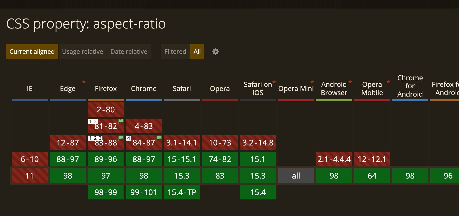
Update: Originally when the post was published Firefox had not yet released support for aspect-ratio, but latest releases now fully support it.

This is probably the preferred method of the masochist.
This method entails setting the iframe’s height and width as a percentage of the viewport’s width.
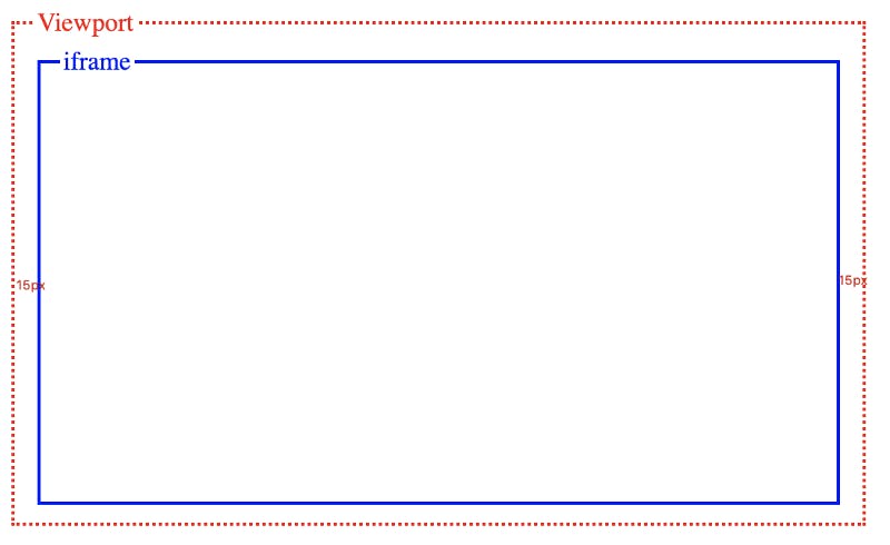
iframe {
  width: calc(100vw - 30px);
  height: calc((100vw - 30px) * .5625);
  max-width: 700px;
  max-height: calc(700px * .5625);
}
With the above styles, our iframe will be the width of the whole viewport minus the 15px padding on either side.
We use the calc() CSS function to achieve this.
Now we need to use calc() again to use what we used for our width — multiplied by .5626 (9/16).
We again set our max-width at 700px — and this time we need to also set an explicit max-height because currently the height is not responsive.
In this case, we achieve the same result with all 3 approaches, but the approaches will likely offer different quirks and benefits depending on their context.


